Kosas & Youth to the People
06.22.2023BRINGING DIGITAL-FIRST BRANDS TO LIFE IN OPEN SELL VISUAL MERCHANDISING
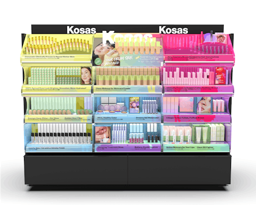
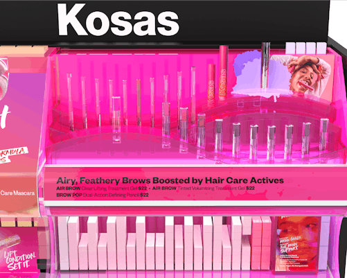
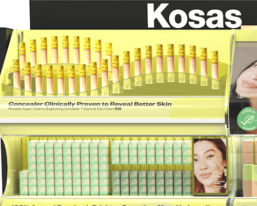
With a fresh rebrand, Kosas looked to Front Row for a new, vibrant design of their merchandising presence in Sephora. Kosas is a clean makeup brand with a focus on “feeling comfy in your skin.” The brand went through a dramatic shift in its brand identity by focusing on founder Sheena Yaitanes love of artistry and candy. Kosas has a hyper focus on clinically proven makeup and easy color, they needed a new in-tore experience that matched the brands ethos and new look.
We focused on the brand’s conception of color mixing, bold brand colors and vibrant gradient to build an own able language in open sell
We aligned the brand’s new energy with bright colors, artistic merchandising and made a bigger expression of the brand’s DNA. From the founders energy to the products and packaging, we built merchandising around a Candy Factory identity. Through bold color we built easy navigation and collection recognition.
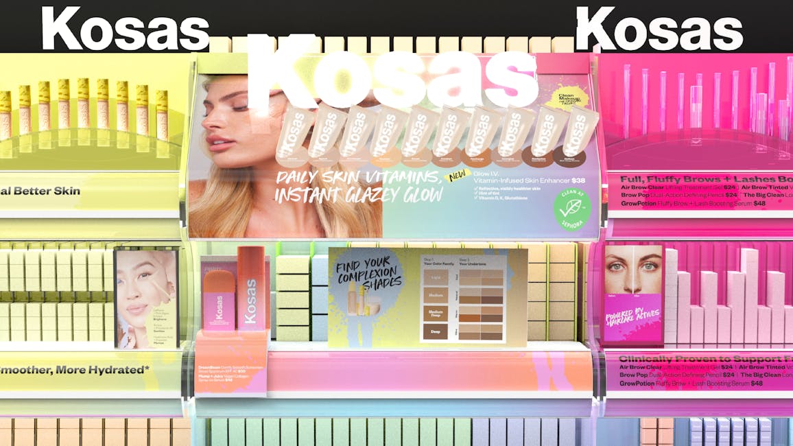
KOSAS
COLORFUL. CANDY. PLAY.
Kosas approached Front Row to design their 2 bay gondola in Sephora. With Kosas’ reinventing themselves with a colorful identity, the visual merchandising needed to make a big splash.
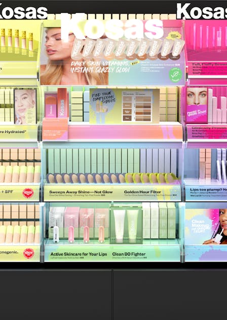
COLORFUL DETAILS AND FLOWING MERCHANDISING
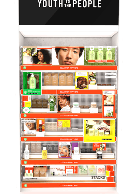
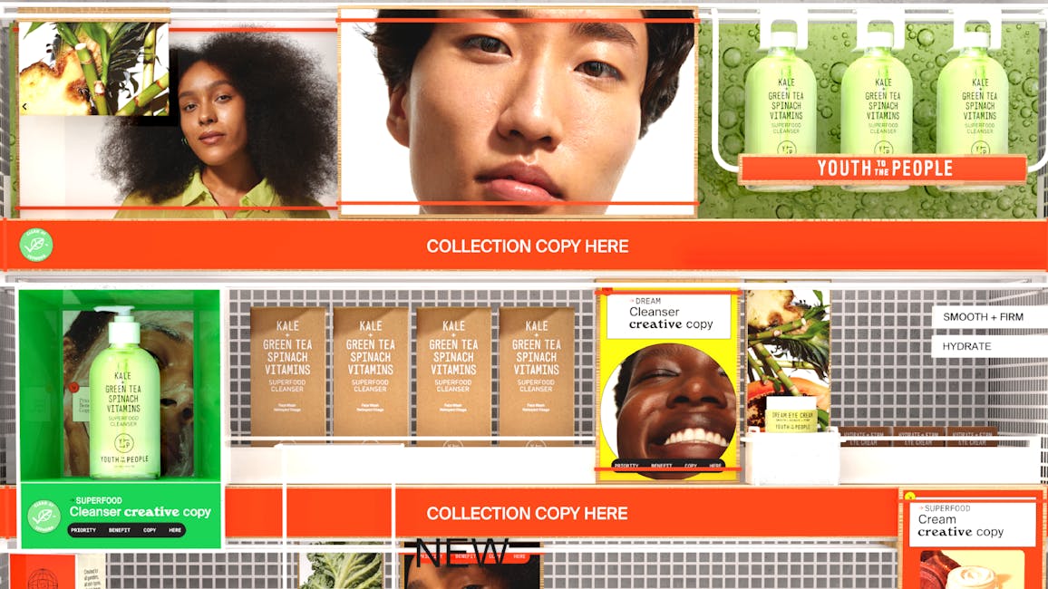
Youth to the People had the great opportunity of doing a complete overhaul of its merchandising in Sephora. They approached Front Row with the opportunity to transform its visual merchandising into a fun, youthful experience. Youth to the People, one of the fastest growing skincare brands, leads the market with remarkable products, clean ingredients and a strong stance on sustainability.
Downtown LA guided our conception of the “youth gallery”. A place of inspiration and education, we designed the language around simplicity, sustainability and art.
With the brands focus on sustainability, we selected materials good for the earth and forms that translated the Youth Gallery in-store. Our result: stripped down design meets sustainability. Our approach started with transforming a 6 shelf linear into a gallery. With this in mind we carefully looked at metals, way finding inspired by installations, and making the brand’s color palette reach a higher potential.
YOUTH TO THE PEOPLE
FROM SUSTAINABLE MATERIALS TO GALLERY INSPIRED DESIGNS, THE NEW LANGUAGE CAPTURED A NEW SENSE OF DISCOVERY AND EDUCATION
Youth to the People was in need of a visual merchandising refresh and tasked Front Row to establish a new language. We began with creating “Youth Gallery”, which reflected the brand’s conscious and modern ethos.