Chapstick
06.23.2026Rebuilding a Legacy Brand From the Ground Up
ChapStick: Rebuilding a Legacy Brand From the Ground Up
ChapStick has been a staple in American pockets since 1880—a legacy that brings both enduring brand equity and an opportunity to evolve for a new generation of consumers. While the brand enjoyed widespread recognition, its visual identity and portfolio architecture no longer reflected how people shop, use, or think about lip care today.
Working in close partnership with the ChapStick team, Front Row embarked on a complete brand transformation, rebuilding the brand from the ground up: strategy, identity, wordmark, and a new packaging system spanning more than 40 SKUs. The result was a modernized brand designed to balance ChapStick's heritage with greater relevance, clarity, and shelf impact.
BRAND STRATEGY & PLATFORM
The Human Truth Behind the Brand
We started where every durable evolution starts: a human truth. ChapStick doesn’t get applied ceremoniously; people reach for it mid-life, mid-motion, mid-everything. Between checking the mirror and walking out, between laughs, looks, and lip-locks.
That insight became the foundation for the brand platform: For the Moments In-Between. This wasn’t a tagline meant to sit beside the logo, but a lens through which all storytelling is expressed. It gives ChapStick emotionally a resonant territory that can expand across formats, stories, and future growth without being tethered to a single functional claim.
Paired with this new expression was Hydration You Can Count On, leaning into our functionality, dependability, and enduring impact on your lips. This is where clarity matters most, and hesitation needs to be removed. The two lines do different jobs but serve the same purpose. Together, they let ChapStick be both emotionally meaningful and functionally undeniable.
WORDMARK & BRAND IDENTITY
140 Years, Reimagined
The ChapStick wordmark was never meant to be reinvented. With more than a century of iconic brand equity behind it, the goal was to preserve its most recognizable archival characteristics while giving it a more confident, contemporary role in the visual system.
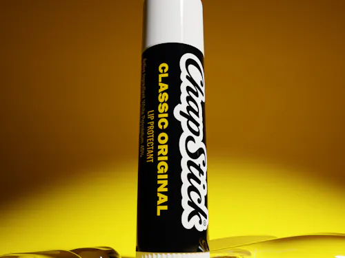
The refreshed wordmark retains the familiar script structure, but introduces a purposeful upward tilt inspired by ChapStick's use of angled typography in archival advertisements dating back to the 1930s. Lifted at a 40-degree slant, the mark feels more dynamic and optimistic while staying rooted in the brand's heritage.
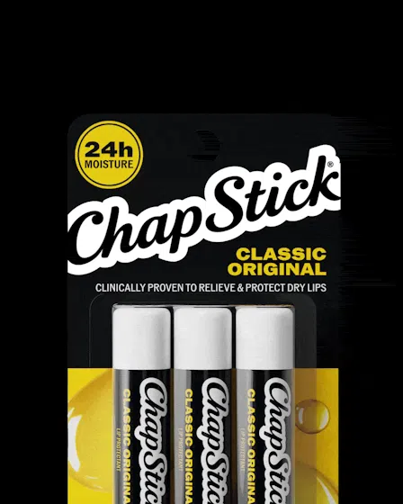
This new orientation also unlocks a stronger packaging system. By increasing the logo scale by over 160% from previous pack iterations and allowing it to crop boldly across the pack, the brand gains greater shelf presence, stronger recognition, and a more modern visual rhythm. The result is a wordmark that feels unmistakably ChapStick, but more ownable, visible, and built for today.
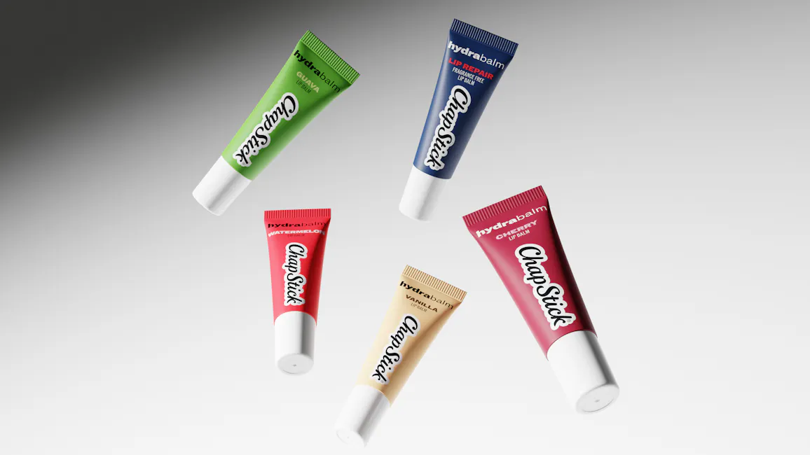
PACKAGING SYSTEM
Built to Navigate, Designed to Sell
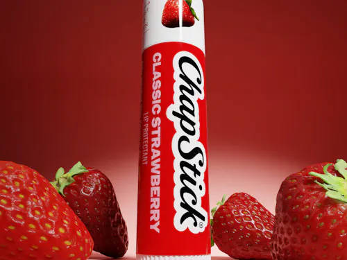
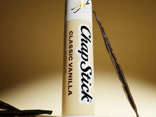
The packaging redesign was guided by four principles: iconic visual language, bold brand presence, preserved color equity, and clear communication. Every decision was informed by consumer feedback, resulting in a system that is easier to shop, navigate, and recognize on shelf.
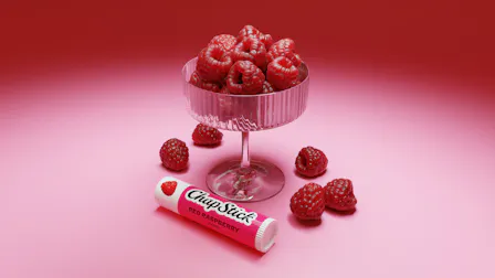
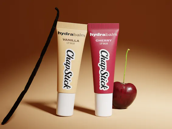
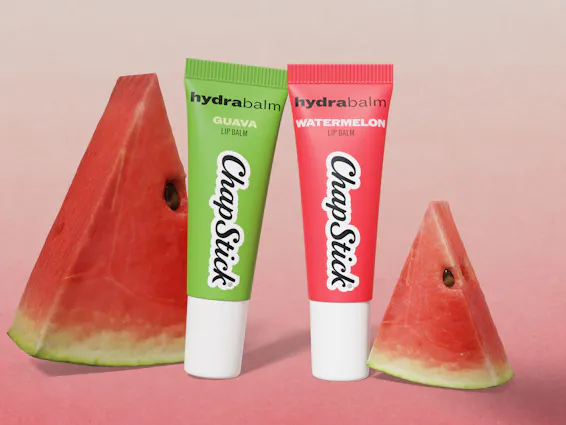
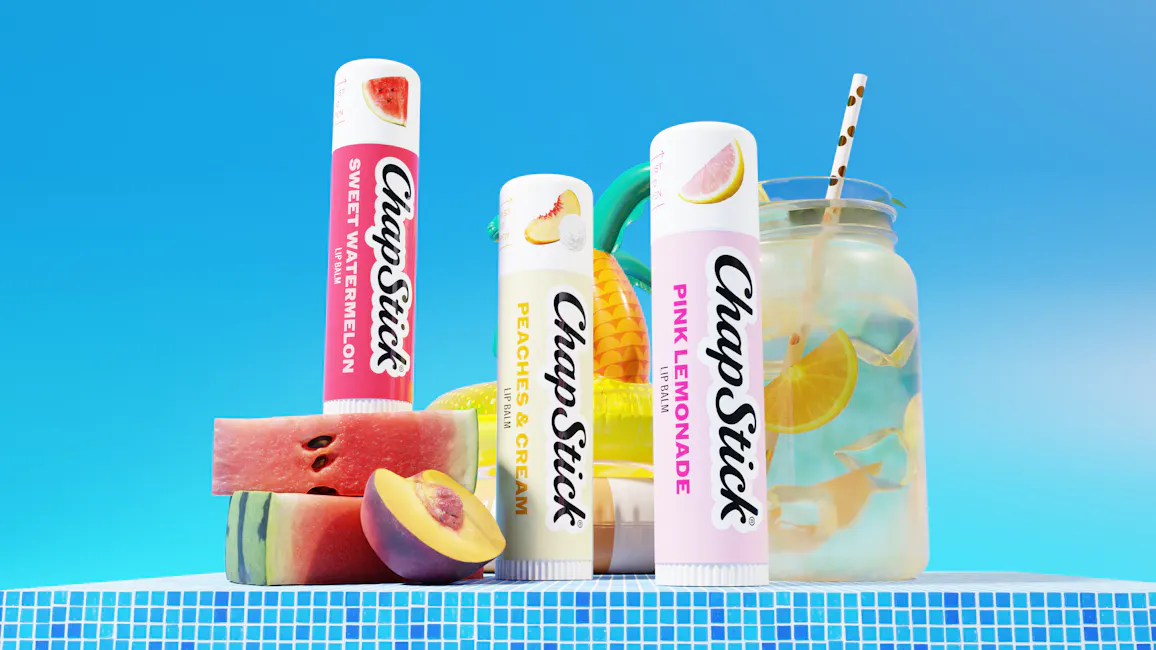
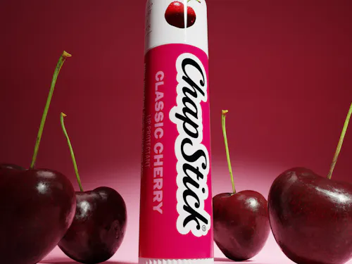
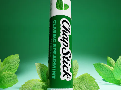
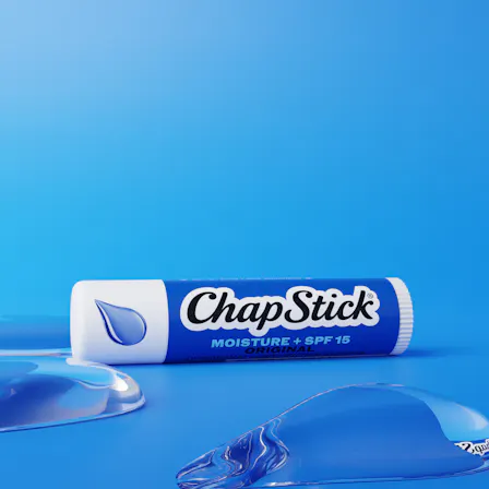
Each product tier follows its own visual logic—from efficacy-led Medicated and Moisturizer SKUs to ingredient-forward Flavors and personality-driven Collections—while remaining unmistakably ChapStick. Color serves as the primary navigation tool, helping consumers quickly identify benefits, flavors, and franchises across the portfolio.
A bespoke seal system and consistent brand equities further unify the range, creating a cohesive experience across more than 40 SKUs. The result is a packaging system that delivers greater shelf impact, clearer communication, and a stronger, more modern expression of the ChapStick brand.
A Brand Built to Keep Building
The execution also doesn’t come alive without the brand book as a foundation. Front Row worked with ChapStick on setting the foundation. Brand fundamentals, tone of voice, key messaging, wordmark rules, packaging architecture, color theory, and seal systems all ensure that the brand has the tools and the language to keep building post-scope. Every future SKU, every new flavor collection, and every Holiday/tentpole event has a north start to orient around.
From brand building to content creation and visual merchandising, Front Row operates the entire system from the ground up. Whether you’re a legacy brand looking for a visual refresh, or a household name looking to stay ahead of the competition, Front Row’s team has the expertise and boutique knowledge to help brands excel in our ever-changing, complex commerce ecosystem.
Connect with our team of experts to learn more.